Heatmaps can bring your data to life. Versatile and eye-catching. There are many situations where they can highlight important relationships in your data. Specifically, we will discuss how you can use them to visualise.
2 Unusual Applications of Heatmaps in Data Science temperature changes, Topographic heatmap
Table of contents :
- What are Heatmaps?
- Temperature changes through time
- Topographic Maps
What are Heatmaps?
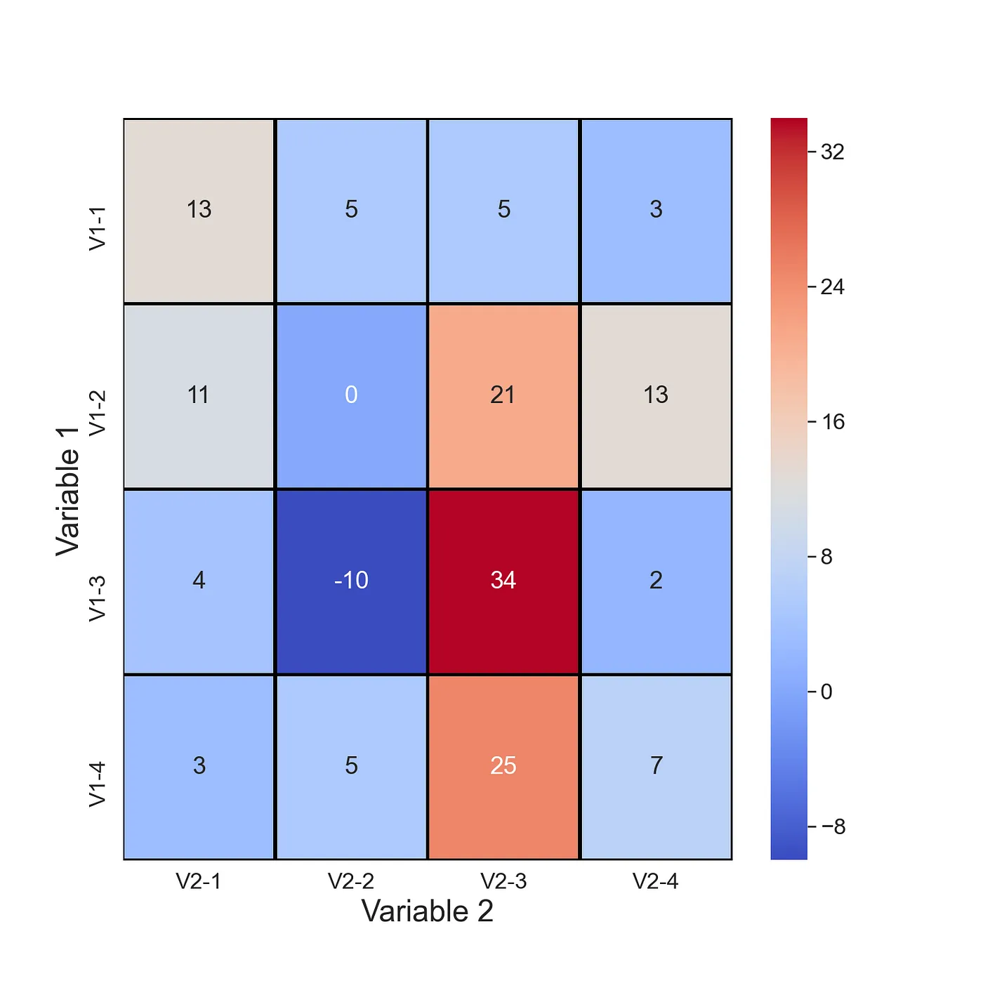
Let’s start by discussing what heatmaps are and why they are so useful. You can see an example in Figure 1. We have variable 1 on the y-axis. In this case, variable 1 can take on different 4 values. That is “V1–1” is the first value for variable 1. Similarly, we have variable 2 on the y-axis. There is also a 3rd variable. That is the value within each of the cells. The colour of each cell is determined by the value of this variable.
Heatmaps are an incredible tool to visualize complex variable relationships in a 2D format. By using colors to represent various values, we can highlight the most important aspects of the relationship and make them easy to understand.
However, it’s important to note that heatmaps are not without their limitations. For instance, variable 1 and variable 2 must be either discrete or categorical. If they are continuous, they should be grouped appropriately. Variable 3 must also be continuous to produce meaningful results.
Don’t worry if this all sounds a bit overwhelming. We will explore five essential heatmaps that will help you make the most of this powerful tool. So buckle up and get ready to take your data visualization game to the next level!
1) Temperature changes through time
Similar to the last heatmap, we use this one to visualise time-series data. Except now, we show how a continuous variable changes through time. In Figure 4, you can see average global temperatures through time. There is a reading for every month from 1900 to 2016. You can clearly see the impact of climate change in the later months. Perhaps we have taken the term heatmap a bit too literally.

Here is the code!
df = pd.read_csv("../data/monthly_csv.csv")

#Only use GISTEMP record
df = df[df.Source == 'GISTEMP']

#Get year and month of record
date = [datetime.strptime(dt, '%Y-%m-%d') for dt in df['Date']]
df['year'] = [dt.year for dt in date]
df['month'] = [dt.month for dt in date]

years = range(1900,2017)
months = range(1,13)

# Create matrix of temprature values
hm_array = []
for m in months:
    hm_array_y = []
    for y in years:
        mean =  df[(df.year == y) & (df.month == m)]['Mean']
        mean = mean.to_numpy()[0]
        hm_array_y.append(mean)
    hm_array.append(hm_array_y)

# Create dataframe from matrix
hm_df = pd.DataFrame(hm_array,columns=years,index=months)

#Plotting confusion matrix heatmap
plt.figure(figsize=(10, 6), facecolor='w', edgecolor='k')
sns.set(font_scale=1.5)

sns.heatmap(hm_df,
            cmap='coolwarm',
            cbar=False,
            xticklabels=10)

plt.xlabel('Year',fontsize=22)
plt.ylabel('Month',fontsize=22)
2) Topographic Plot
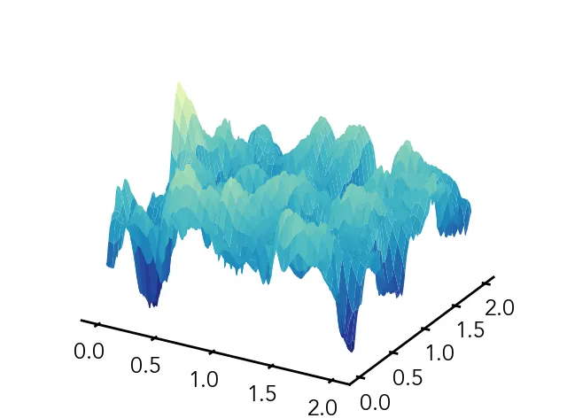
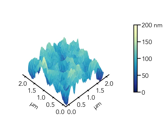
A topographic plot is a type of data visualization that helps us understand the 3D topography of the land through the use of contour lines. These lines connect points of equal elevation, creating a 2D map that represents the land’s elevation in a clear and concise way. You’ll often see these contour lines spaced at regular intervals on the plot, which allows us to visualize the changes in elevation as the terrain changes.
Now, why is this important? Topographic plots are commonly used in geographic information systems (GIS) and are important tools for many different applications. For example, civil engineers use them to plan and design infrastructure, while environmental scientists use them to monitor and protect the environment. Geologists also use topographic plots to study the earth’s structure and history.
Topographic plots are particularly useful for identifying changes in elevation that can impact the flow of water or create hazards such as landslides. By understanding the terrain, we can make more informed decisions about where to build infrastructure or how to protect the environment.
# Plot surface, this is without any customization.
plot = ax.plot_surface(X=X, Y=Y, Z=afm_data, cmap='YlGnBu_r', vmin=0, vmax=200)`

Here is an example code :
# Create meshgrid
X, Y = np.meshgrid(np.linspace(0, 2, len(afm_data)), np.linspace(0, 2, len(afm_data)))

# X — grid of x-values

# Y — grid of y-values

# Z — grid of z-values

# Adjust plot view
ax.view_init(elev=50, azim=225)
ax.dist=11

# Add colorbar
cbar = fig.colorbar(plot, ax=ax, shrink=0.6)
cbar.set_ticks([0, 50, 100, 150, 200])
cbar.set_ticklabels(['0', '50', '100', '150', '200 nm'])

# Set tick marks
ax.xaxis.set_major_locator(mpl.ticker.MultipleLocator(0.5))
ax.yaxis.set_major_locator(mpl.ticker.MultipleLocator(0.5))
# Set axis labels
ax.set_xlabel(r'$\mathregular{\mu}$m', labelpad=20)
ax.set_ylabel(r'$\mathregular{\mu}$m', labelpad=20)
# Set z-limit
ax.set_zlim(50, 200)

# Plot surface
plot = ax.plot_surface(X=X, Y=Y, Z=afm_data, cmap='YlGnBu_r', vmin=0, vmax=200)

Here is a real-life contour map of Norway based on population:


